Mniami
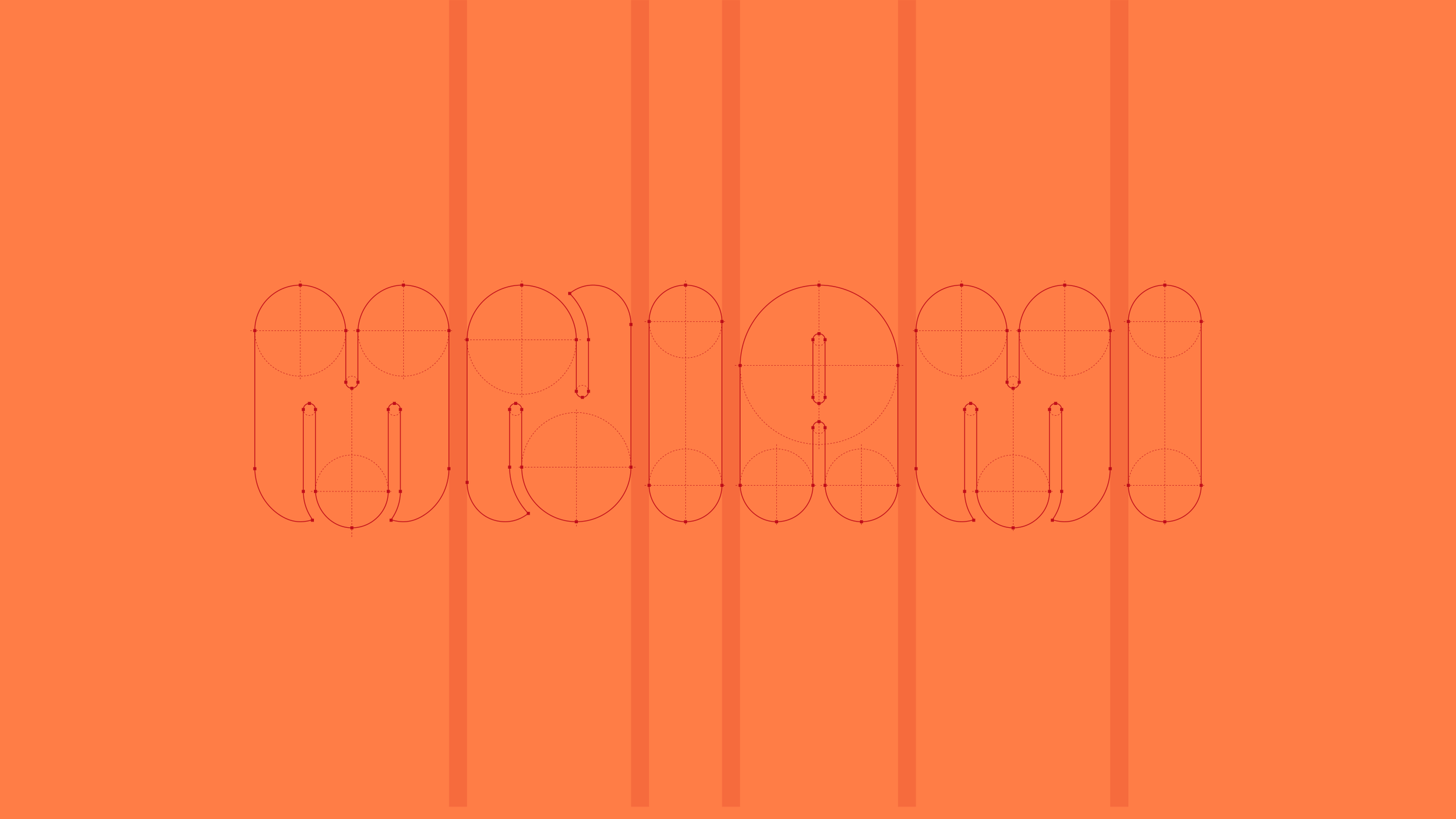
Mniami. Tasty brand of sweets in Eurocash own label’s portfolio.
brand strategy, communication strategy, brand positioning, brand design, packaging design, creative art direction, production supervision
Happy, delicious and friendly
In 2024, we once again had the pleasure of working for Eurocash, this time on the creation of a completely new brand within their private label portfolio, focused on non-chocolate sweets.
The task was to create a name, visual identity, brand hero, and packaging design standard that would help differentiate the products on the shelf in this highly demanding category.
Eurocash's meticulously crafted creative brief helped us find the right solutions. The brand was intended to be happy, delicious and friendly.
Meet Mr. Mniam
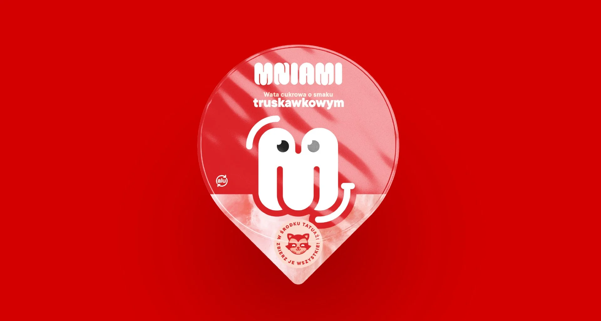
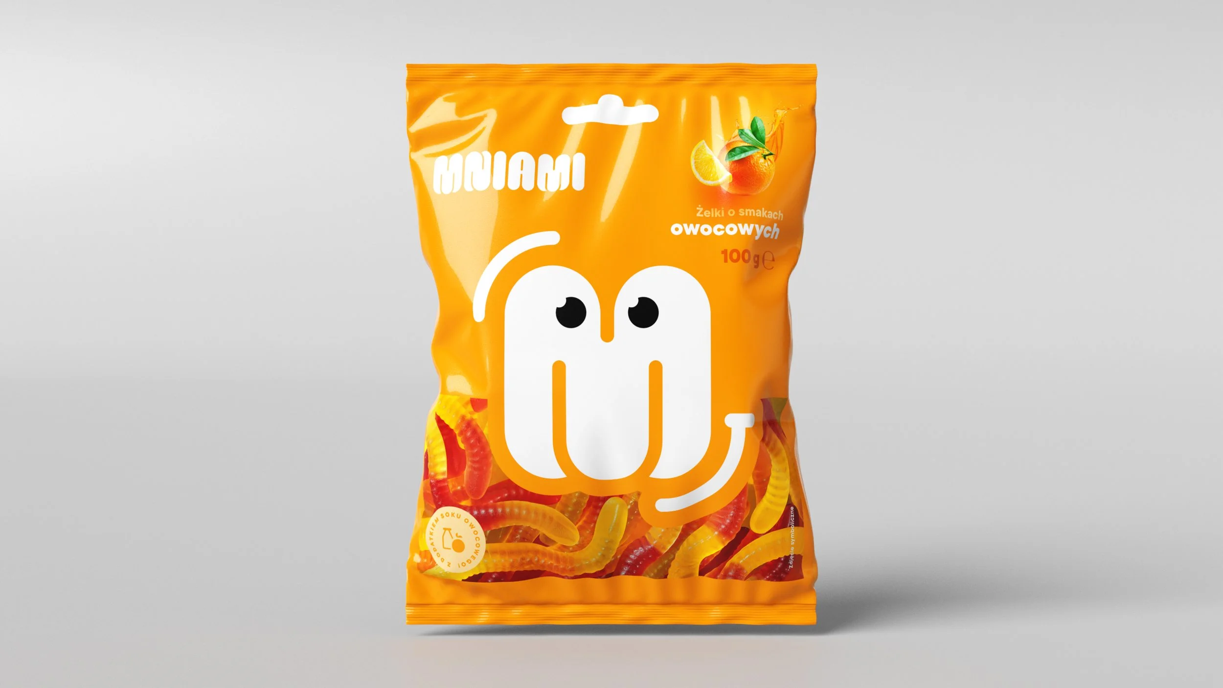
Meet Mr. Mniam! Your ultimate guide to the world of joy and flavor. Mniam is an emoticon, full of positive energy that accompanies us when we consume Mniami products. He expresses emotions, smiles, winks, and brings a positive mood whenever we need it.
It's impossible to miss him on the store shelf. He could be the hero of many delicious stories.
Many flavors and tons of joy!
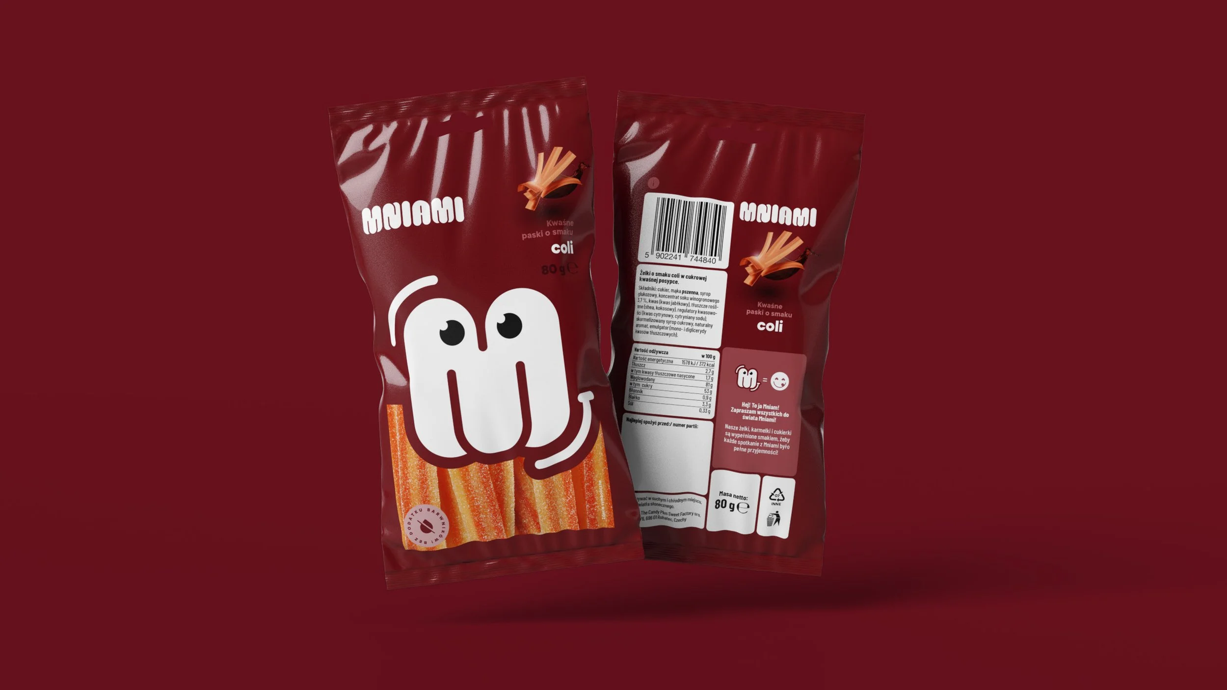
The creative concept had to be strong enough to maximize recognition and readability while also allowing for the freedom to create packaging for many different flavors and varieties of sweets.
Positive emotions, smiles, and a sense of joy are precisely what Eurocash wanted to convey to its brand audience. Hence, the idea of creating a single, central graphic element (brand hero) that would unify the entire range of packaging.
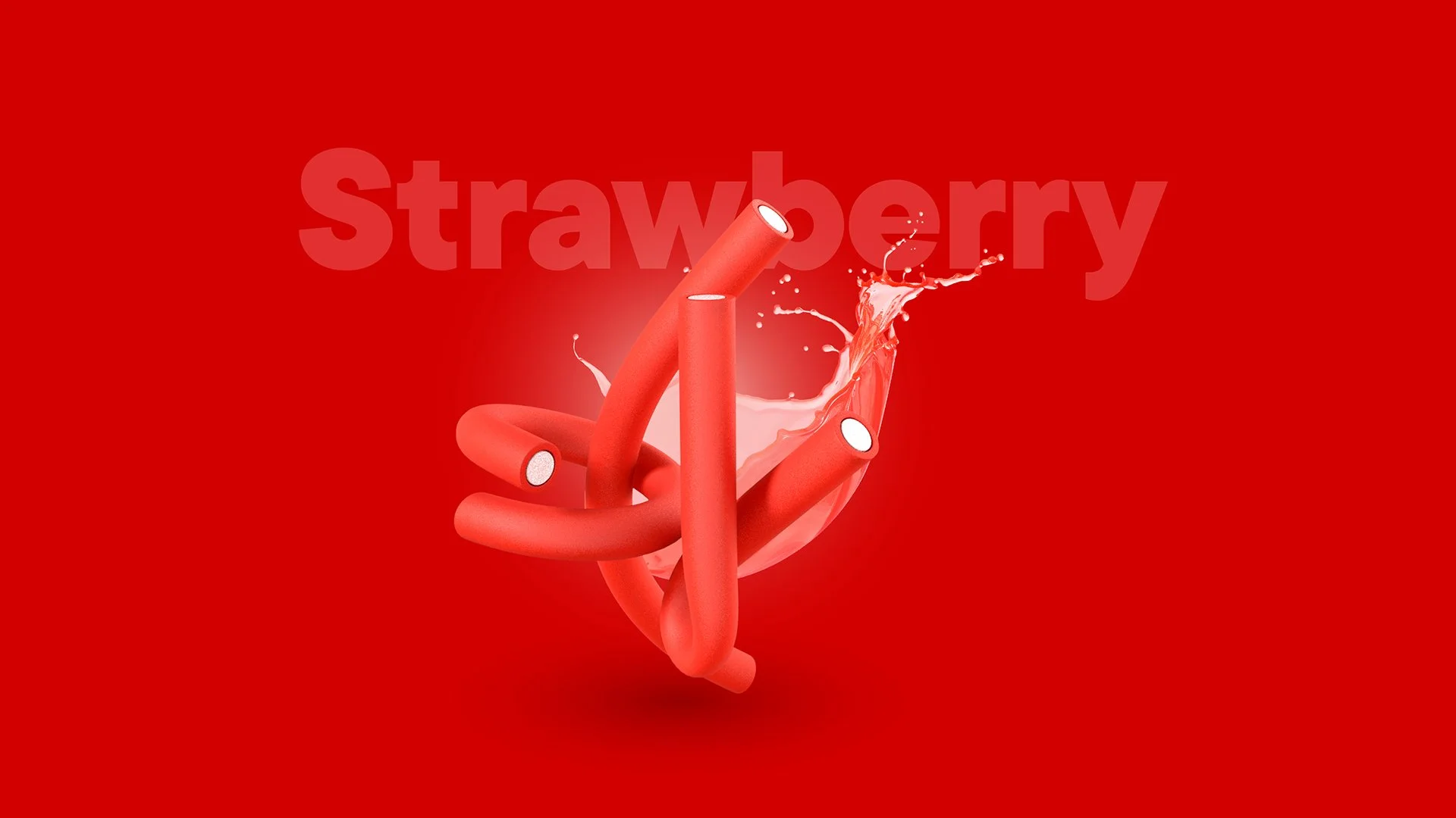
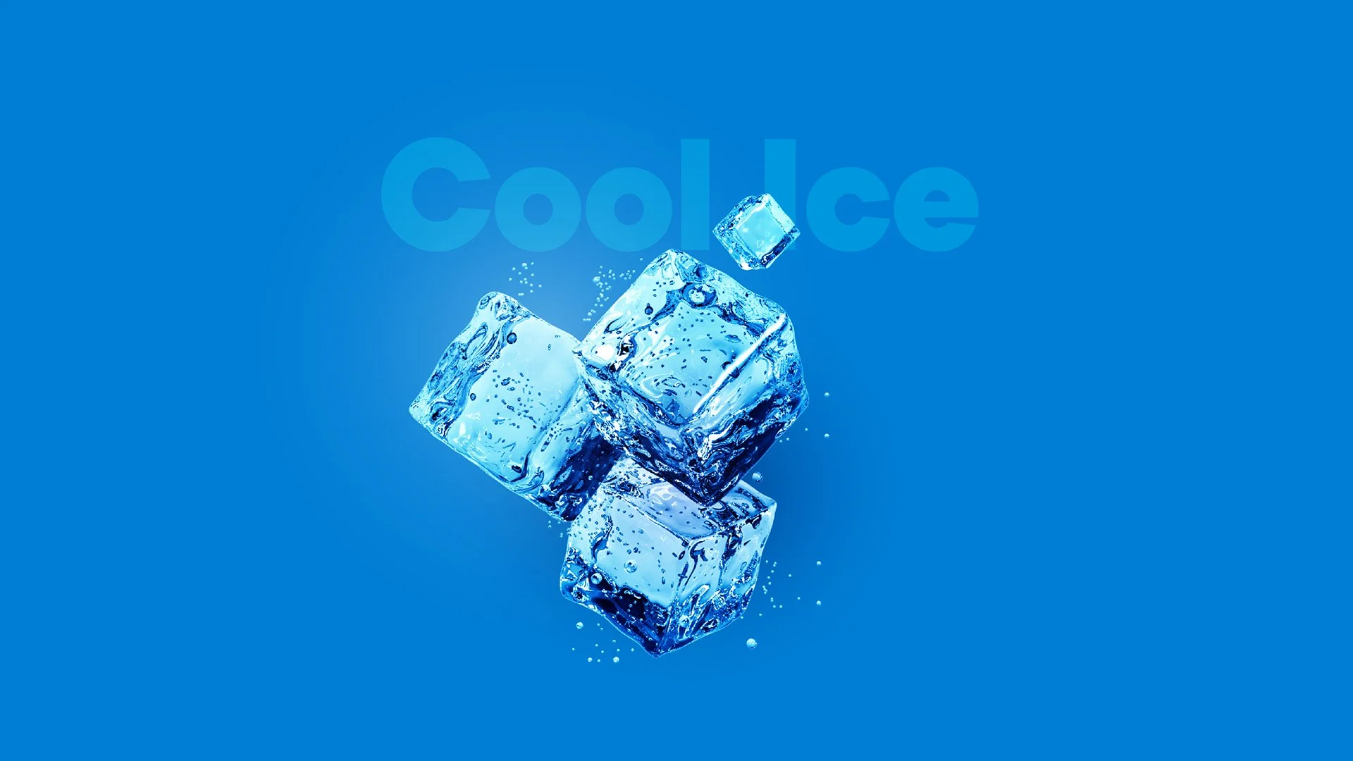
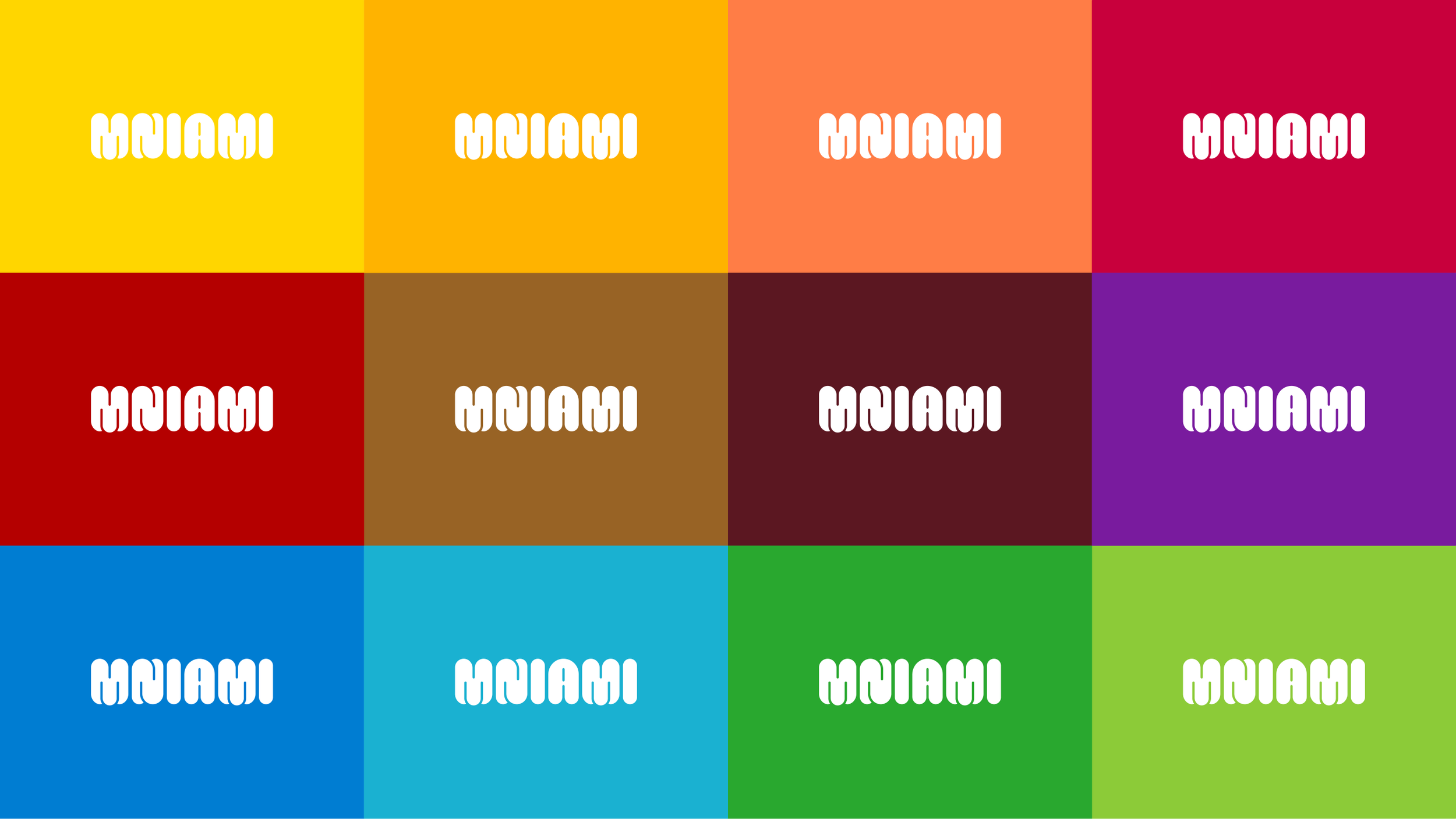
The brand's color palette had to be broad enough to, combined with dynamic illustrations, easily describe a wide range of flavors.
Finally, the brand name itself and the name of its hero are inseparable associations with the reaction each of us has when we have the opportunity to consume something delicious.
Design supported by science
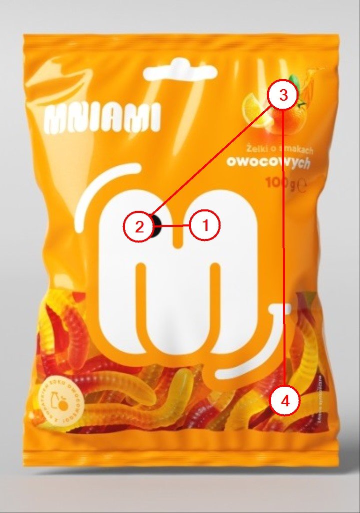
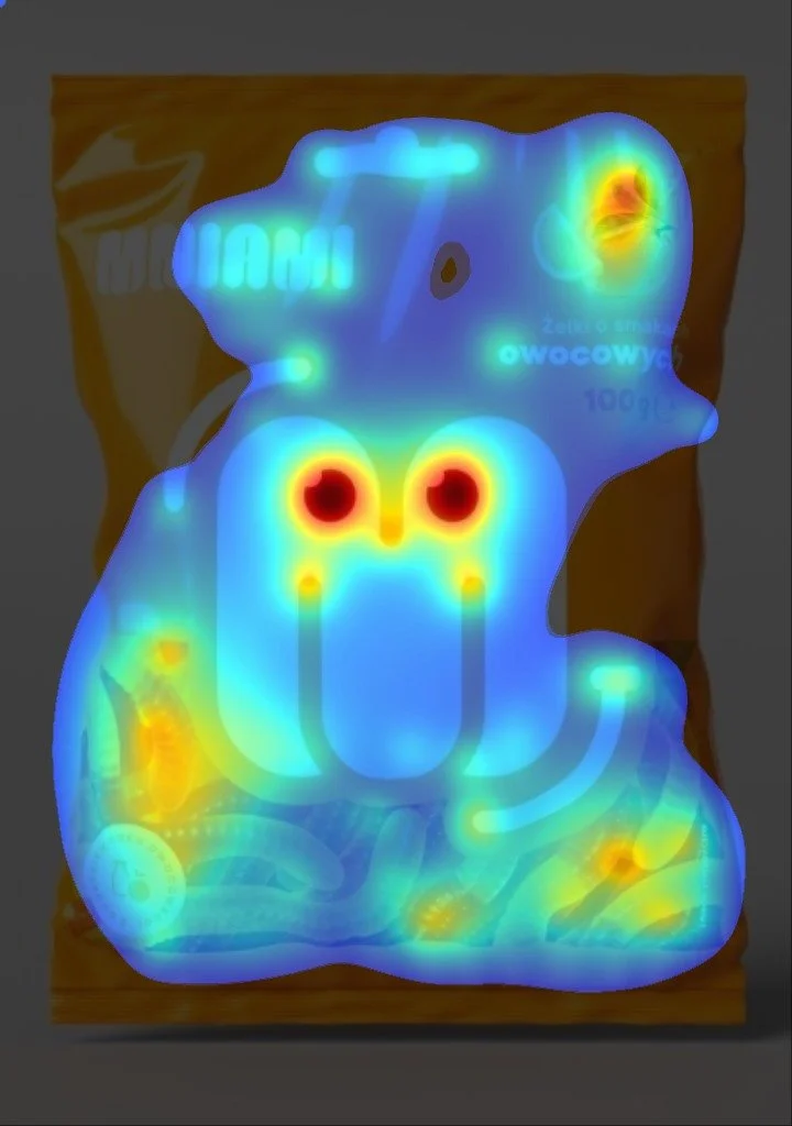
Designing packaging that is not only aesthetically pleasing but also effectively engages potential recipients is a process we always support with AI-based analytical tools.
This helps us to analyze, test, and refine the design throughout the process, ensuring the final result is the best possible.
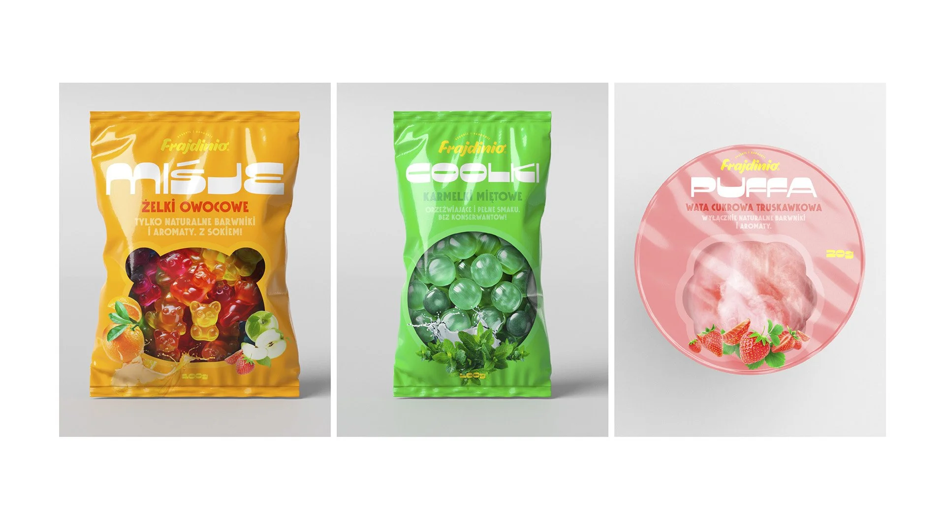
Alternative proposal
The Shape of Joy was an alternative proposal developed as part of this project.
However, during analyses and testing of the brand name, visual identity, and packaging design, the investor's team (Eurocash) decided to implement the Mr. Mniam concept.
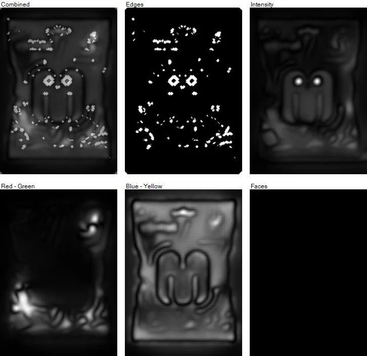
During many iterations, we examine parameters such as: the recipient's areas of interest, which are reached within the first 3-5 seconds of contact with the packaging, the order in which individual messages are read, heat maps, etc.
This allows us to save a significant amount of time and money needed to assess the potential of a specific packaging design.
We can also analyze in detail the types and intensity of visual elements present in the packaging design.

